Directeur Artistique Digital, UX/UI designer senior à Paris depuis plus de 11 ans, j’accompagne les entreprises pour leur permettre d'atteindre leurs utilisateurs à travers des fonctionnalités simples et intuitives, une communication digitale efficace et des sites web et application mobiles claires.
CHANEL_banner.jpg

Chanel : Color Comparator • UX/UI (EN)

(Version en français par ici)
Chanel
aims to add more colors to its online website. Unfortunately, the brand-style guide allows us to use only 3 colors: black, grey and white... However, Chanel had a large range of colors in their products, but to go beyond that we decided to tweak some features, and is this case: the product color comparator. We worked on the interactions to allow the user to explore all Chanel's product colors with all different tints. 

I was in charge of the check out experience, designing the UX/UI and visual elements, we produced high-fidelity mockups with functional animated specifications that developers at AKQA would use to build the site.

Worked as designer and art director for AKQA Paris
Deliverables: Responsive color comparator experience

Product detail page


compare up to 3 different colors

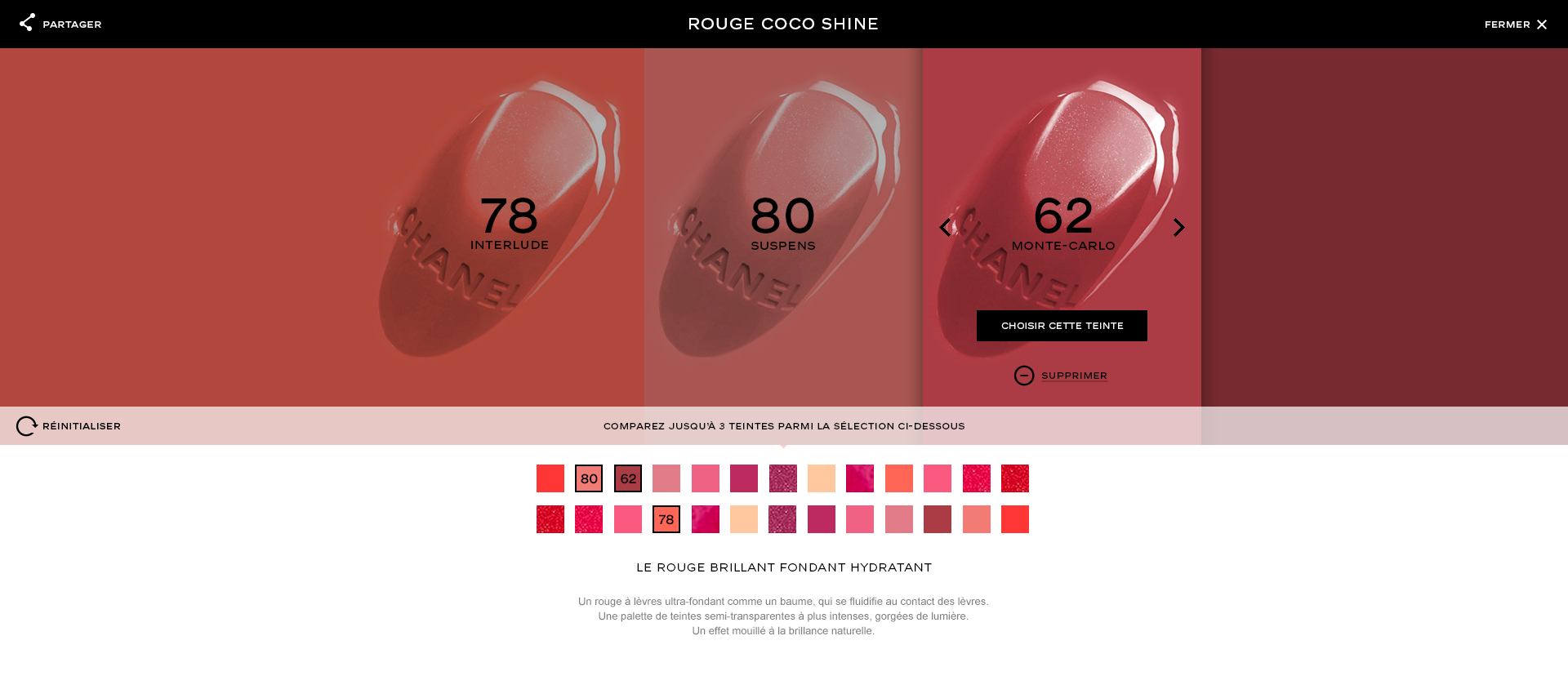
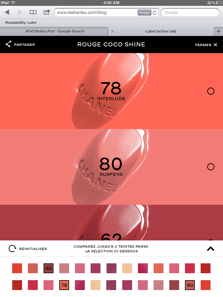
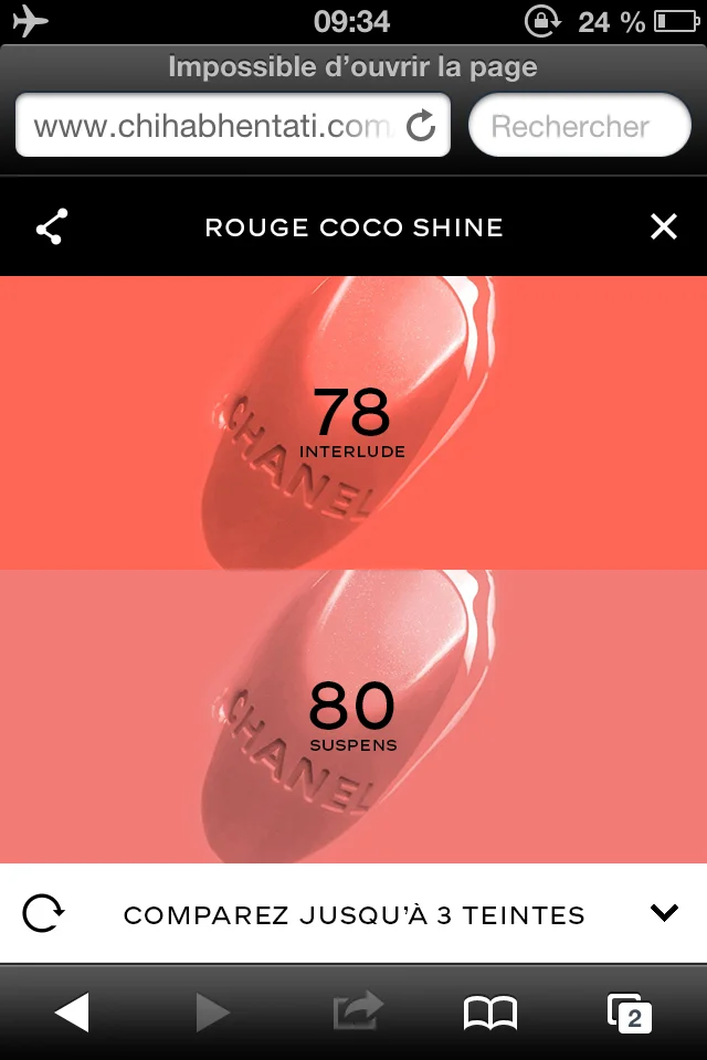
As shown above in the product detail page, the color range is quite large. A lot of them are quite close, so to facilitate the comparison, we first took the opportunity to show them in big, then to display it own color reference and the name, it helps to distinguish them easily. The user selects the first color, then each time a color is added, it slides from the right. The comparator occupies all the screen width.


Color Swap interaction


The focus of the page really is on the color comparison experience. We made possible to move every color block to place it close to another. Just hover on it, click (or tap) and then slide it to the left or the right as shown below..


color delete

The following animation shows the interface animation when a user deletes a color.

Design screens


Final Screens